
Remember the days we used to put a static image of a roadmap on a website, usually accompanied by silly directions in case you came from the North, South or Mars? It was only some time later, when the web matured and google stopped being just a search engine, that a new corporate ‘how to get here / where are we located’ toy was born. Google invented google maps, pretty soon yahoo followed and Microsoft, well… they tend to do everything the rest does, it only takes them a little longer. Forget yahoo and bing! maps, only if your a fanboy you’ll use them and even then you’re not sure how long they will be around (- cf. yahoo & geocities). Google maps was and is the way to go. Every post-iPhone smartphone has google maps (except the windows phones who use a mediocre version called bing maps).
Anyway, let’s focus on what this is all about!
Nowadays static maps (drawn by the guy who works at the ‘art department’) aren’t really used anymore. Using google maps is fancy and allows you to zoom in/out, get directions, have a satellite view or even streetview. The sky is the limit and, let’s face it, we all jumped the maps boat.
Fast forward to… now!
When we’re developing websites we mostly use google maps somewhere. Inform where an event is held, a company is located or to find the nearest dealer in town. There are many ways to include google maps and the most easy way is to use an iframe with the map embedded. Real men tend to use the maps API to embed the map in the website. It’s al sunshine and lollipops! Until you use a mobile device to surf to the website. Sure the maps work just fine unless the map is too big and you end up in the Maps scrollbar of death™.
So what is the Maps scrollbar of death™ exactly?
When scrolling on your mobile phone or tablet it all works fine, but as soon as your finger hits a google maps you start repositioning the map inside its container. Not a big issue if you have some space around it so you can keep scrolling. Worst case you can usually tap the menu bar on top to regain access to the top of the website, if not: You’re screwed!
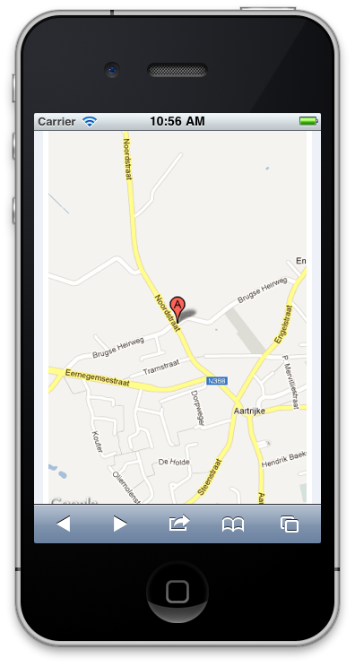
So do we need to use the iframe or flash solution? Sure not! You could use the google maps static image API to include the map but then again, we could be using the static image from the guy of the art department, no? So the goldilocks solution is to show the full blown map api on non-mobile / tablet websites and use the static image api on mobile / tablet websites.
Simple solution
The easiest way to achieve this is… to embed both the iframe and the static image and show / hide the appropriate one using some CSS and media query magic.
Plugin solution
Why you should use this plugin? No reason, whatsoever! I just hate it to use the iframe, specially if I have markers and balloons and other stuff to display. That and the fact I hate using the google maps API to geocode addresses and place markers. Therefore I was thinking of a plugin that I could easily pass the address and possible markers to and it would magically show the map or the static image. If I link the static image to maps.google.com with the appropriate address most mobile devices will open their maps application instead! How cool is that!
So without further ado: the jquery responsive google maps plugin (still in progress). The technical mumbo jumbo is on the github readme page, so feel free to comment, add feature requests, fork me or even help me finish this.