As "a guy who knows his way around computers" I looked it up on this online encyclopedia called wikipedia:
A site designed with RWD adapts the layout to the viewing environment by using fluid, proportion-based grids, flexible images, and CSS3 media queries, an extension of the @media rule, in the following ways:
— Wikipedia
- The fluid grid concept calls for page element sizing to be in relative units like percentages, rather than absolute units like pixels or points.
- Flexible images are also sized in relative units, so as to prevent them from displaying outside their containing element.
- Media queries allow the page to use different CSS style rules based on characteristics of the device the site is being displayed on, most commonly the width of the browser.
As much as it is true, I can't agree with the fact that we need media queries, responsive images and a fluid grid concept to make a website responsive.
Let me take you on a trip down memory lane
The first website ever was published by the World Wide Web’s creator Tim Berners-Lee on August 6, 1991. A simple page explaining the world wide web and how you could be a part of it by creating your own webpages. It didn't take long before all hell broke loose and we started seeing epileptic brainfarts like this:

I have to admit, when playing around on the web mid 90's using <marquee> and <blink> tags, I've created some eyebleeding creatures. Luckily some smart people found out that <table> could be used to position elements on some kind of grid. All big players were doing it so it had to be good stuff!

So now we had the first decent layouts and shit got real! Browser vendors were implementing features at a rate that no one could follow just and it didn't take too long before they diverged. Different spec implementations combined with a jungle of screen ratios gave birth to buttons stating a webpage was best viewed in netscape 4.0 on a 480 x 640 screen etc...

And then some Norwegian guy (Håkon Wium Lie) came around and developed CSS, separating content and layout. Mind was blown! The community started to adapt and realised that using tables for layout was semantically not correct. A new era began: <div> to the rescue!

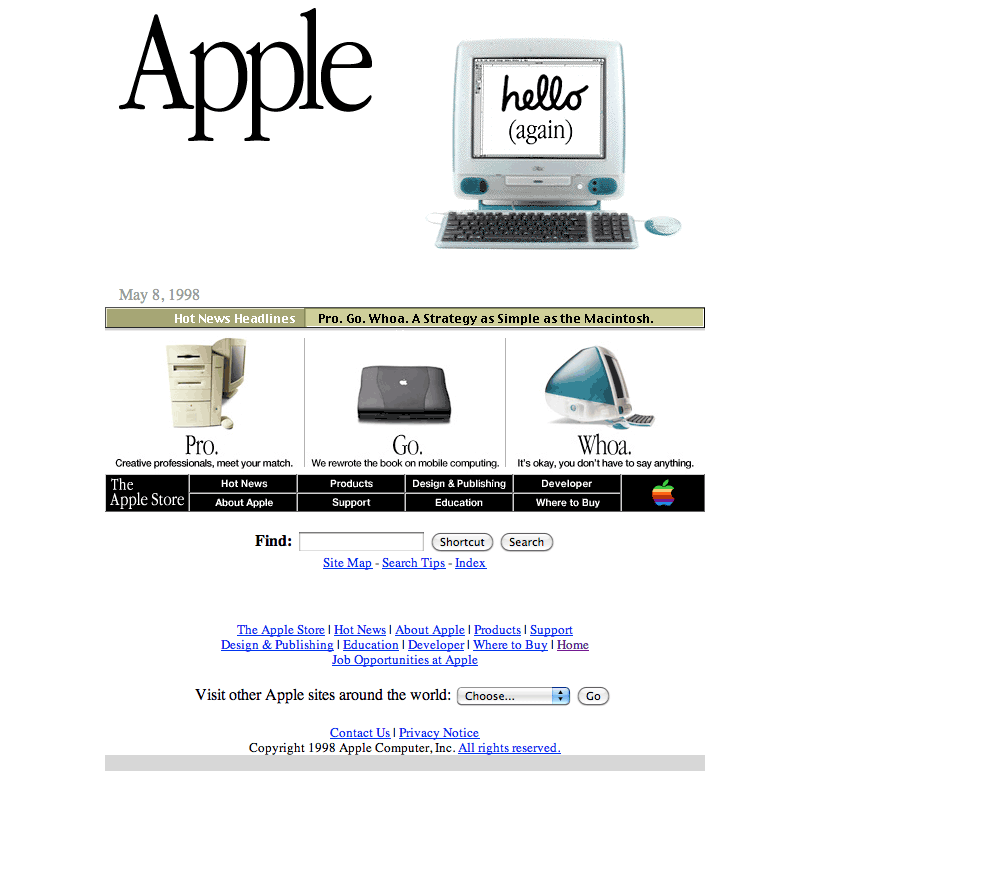
As with the tabular mindset, fixed width of websites was still the way to go and we gradually moved up to 968 pixels as everybody had 1024px screens. I never really understood where those 968 pixels came from because scrollbars were 24 pixels wide... Anyway, we kept on getting new features in css, browsers became civilised again, internet connections became faster and boy, were we on a roll. It was until 2007, when apple launched their first iphone, that the internet shifted! Those fixed width websites were hardly readable on those tiny telephone screens so something had to be done.
Responsive web to the rescue!
Media queries, viewport schmuck, touchevents, etc... All needed to build a responsive web? Not really! We, the developers, strive to build great experiences by creating boundaries for our own. We make function follow form instead of the other way around. Most, almost all of our problems are self created constraints. Ever since
The web has always been responsive!
So back to our initial 3 statements:
1. Fluid grid concept
So we need to size elements with relative units like percentages, rather than absolute units like pixels or points? By default everything is relative to the viewport. Even without grid concepts like flexbox or grid everything remains in the viewport. Why are we so desperate to put everything on a grid? Ever since we started using tables for layout we continued on this path of grid layouts, mirroring a print mindset to a different medium. We think we are pushing the web forward but we still have a long way to go.
2. Flexible images
As previous concept, these should be sized in relative units, so as to prevent them from displaying outside their containing element. I've had to use a little max-width trick to make the images on this page behave but other than that they're fine. I could have used responsive images but that's a road I'm not willing to take. The spec itself is utter crap. Having multiple image sources for all different viewports and screen densities? At the rate pixels per inch are evolving we will have a shitload of images to maintain. Compare it with the evolution of movie resolutions. I can view a full HD movie on my crappy screen and vice versa. Most important: the purpose of the web is sharing content.
3. Media queries
Allowing the page to use different CSS style rules based on characteristics of the device the site is being displayed on, most commonly the width of the browser. These were actually proposed in 1994 by Håkon Wium Lie but didn't make in in the CSS1 spec. Since CSS2 we have media type support which makes sense: displaying content on a computer screen, projecting, braille, speech, print, etc... By adding media features like device width, height, orientation, aspect ratio, resolution and so on we can create very powerful stylesheets but we're still not there. I'd love to have a media query to know my visitors connection speed and some element queries.
As much as I'm bashing on the whole responsive web design, I'm also loving it. My only fear is that the web development today is no better than the space-background / animted gif pages we created 20 years ago. We are still positioning elements on a grid, thinking we are creating beautiful experiences but I feel we're missing the true point of the web. To put things in context I want to compare the evolution of the web with the history of film. It all began in the 1890s, when motion picture cameras were invented but it took them 37 years until the first movie with sound was released. Our medium is still young and immature, let's try to raise our web and give it a prosperous future!
We are exploring and learning new stuff for the web on a daily basis, but claiming responsive web is a couple of years old and is all about fluid grids and images using media queries? Naaaaah!
Thanks @bytte, @bramus and @bengie for the feedback. The @b is strong in this one.